快速分析
In Microsoft Excel 2013, the Quick Analysis tool makes it possible to analyze your data quickly and easily using different Excel tools.
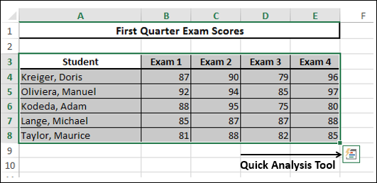
You can use Quick Analysis with a range or a table of data. To access Quick Access tool, select the cells that contain the data you want to analyze. The Quick Analysis tool button  appears at the bottom right of your selected data.
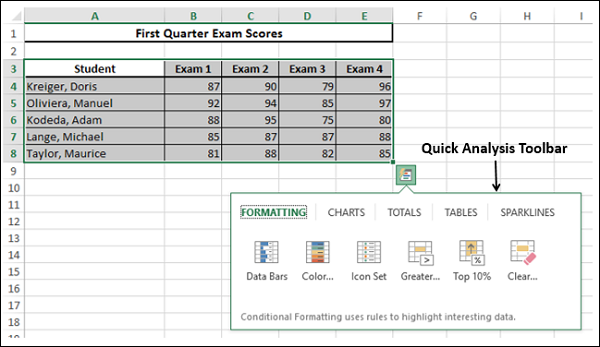
Click the Quick Analysis  button. The Quick Analysis toolbar appears with the options FORMATTING, CHARTS, TOTALS, TABLES, SPARKLINES.
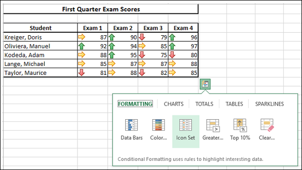
Quick Analysis tool is handy and quick to use as you can also have a preview of applying different options, before selecting the one you want.
Formatting
Conditional Formatting allows you to highlight parts of your data by adding Data Bars, Colors, etc. This lets you quickly visualize the values in your data.
You have learnt about formatting rules in the Conditional Formatting chapter in this tutorial. The difference is that you can have a quick preview and select the option you want. However, if you want to utilize all the features of Conditional Formatting, you rather go through the main menu on the Ribbon. The same thing holds for all the options in the Quick Analysis tool.
Click Formatting on the Quick Analysis toolbar. The Conditional Formatting options appear in the toolbar. Move your mouse on the options. You will see the previews. You can then select the option you want by clicking it.
Charts
Charts are used to depict the data pictorially. There are several types of Charts to suit different types of data.
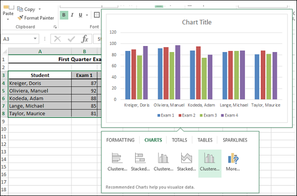
If you click CHARTS on the Quick Analysis toolbar, the recommended charts for the data you have selected will be displayed. You can always choose More Charts option if you want to go to the main Charts on the Ribbon.
Hover your mouse on the options. You will see the previews. You can then select the option you want by clicking it.
Totals
Totals can be used to calculate the numbers in columns and rows. You will have functions such as Sum, Average, Count, etc.
We will go into the details on how to use Quick Analysis tool with TOTALS later in this chapter. You can use the other options in Quick Analysis with the same ease, as you observe.
Tables
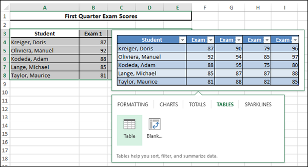
Tables help you to filter, sort and summarize your data, as you have already learnt in the Tables chapter. In the Quick Analysis tool, both the Table and PivotTable options are available under TABLES. However, you can have a preview for the table, but in the case of PivotTable no preview is available as by clicking you will get an empty PivotTable which you need to populate with the data.
Sparklines
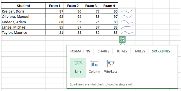
Sparklines are tiny charts that you can show alongside your data in single cells. They provide a quick way to see trends.
Quick Analysis with TOTALS
Click on TOTALS in the Quick Analysis Toolbar.
In Quick Analysis with TOTALS, you can analyze
Row-wise 
Column-wise 
For row wise calculations, ensure that you have an empty row below the selected data.
Example
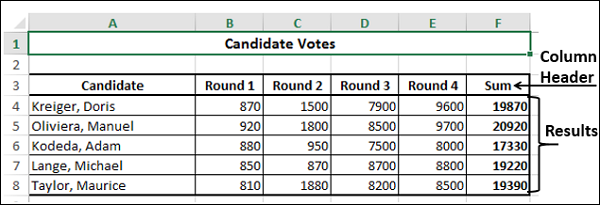
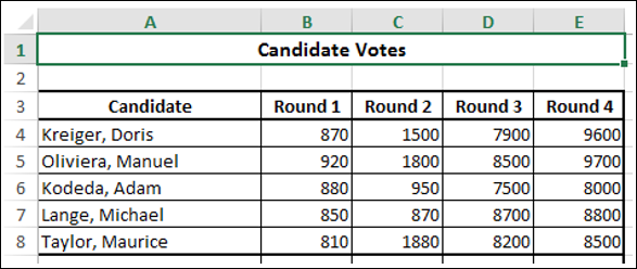
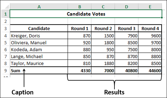
We will analyze the data of the votes polled in an election for five candidates. The counting is done in four rounds. Following is the data.
Sum
Select the data and Click  on the Quick Analysis toolbar under TOTALS.
Ensure that the row below the data is empty. Otherwise, you will get a message saying that there is already data present there and you will only have two options, either replace the existing data or cancel the operation.
In the row below the selected data, the sum of each column of the data is displayed. The caption Sum is also automatically provided. This means the total count of votes in each round for all the candidates is displayed.
Average
Select the data and click  on the Quick Analysis Toolbar under TOTALS.
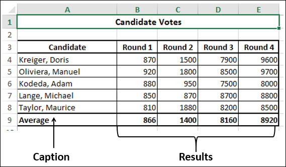
The average of each column of the data appears in the row below the data. The caption Average is also automatically provided. The average number of votes polled in each round is displayed.
Count
Select the data and click  on the Quick Analysis Toolbar under TOTALS.
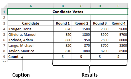
The count of each column of the data appears in the row below the data. The caption Count is also automatically provided. This means the count of candidates in each round is displayed.
%Total
Select the data and click  on the Quick Analysis Toolbar under TOTALS.
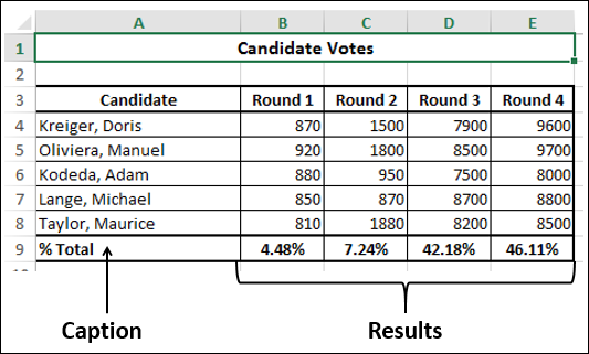
The %Total of each column of the data appears in the row below the data. The caption %Total is also automatically provided. This means the %Total of votes in each round is displayed.
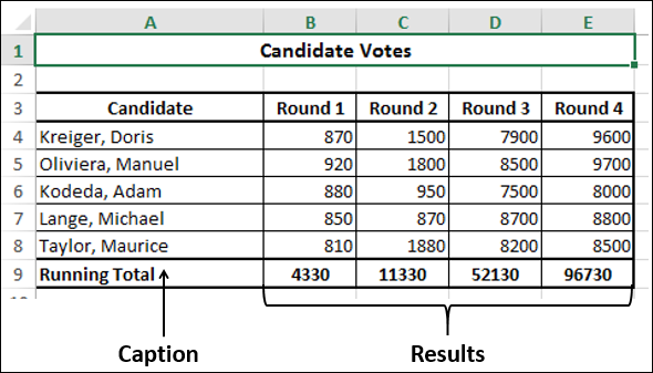
Running Total
Select the data and Click  on the Quick Analysis Toolbar under TOTALS.
The running total of each column of the data appears in the row below the data. The caption Running Total is also automatically provided. This means the running total of votes across the rounds is displayed.
Sum of Columns
Select the data and click  on the Quick Analysis toolbar under TOTALS.
Ensure that the column next to the data is empty. Otherwise, you will get a message saying that there is already data present there and you will only have two options, either replace the existing data or cancel the operation.
In the column next to the selected data, the sum of each row of the data is displayed. The column header Sum is also automatically provided. This means the total number of votes polled for each candidate in all the rounds is displayed.
